HMI best practices to improve operator efficiency
By: Josh King
Today’s traditional HMIs are thought of as highly sophisticated. But they’re actually inundated with too much data and not enough information. Too many colors. Too much distracting animation and detail. Too many numerical values. Too much real-time (vs. trended) information.
Because the HMI is not optimally designed, it actually reduces the optimum operator response time to abnormal situations. In short, a traditional HMI design is more likely to increase human error.
What is situational awareness HMI design?
Situational awareness (also known as high-performance HMI) is operator-centered HMI design. The interface is designed to be clear and intuitive. It allows operators to anticipate tasks, detect abnormal situations, and make confident decisions.
In three words, situational awareness is:
- Informative. Instead of just displaying data, it’s contextualized into information an operator can easily understand. Operators don’t have to memorize setpoints, and few (if any) calculations are necessary.
- Boring. But it’s supposed to be. Situational awareness design is usually gray with hardly any colors, no animation, and no 3d graphics. By minimizing distractions, operators can focus on the HMI’s purpose: identifying processes that deviate from a normal operating state.
- Proactive. Today’s traditional HMI encourages a very reactive alarming approach to facility management. With situational awareness, important processes include trending data graphs which allow operators to predict and proactively investigate issues before something goes wrong. According to the High Performance HMI Handbook, an operator using a traditional HMI only detects abnormal situations before an alarm occurs 10% of the time. An operator using a situational awareness HMI detects situations 48% of the time before an alarm goes off.
Traditional HMIs don’t meet operator needs
Can your operator answer these three questions within 5 seconds when looking at your HMI?
- Are you reaching your KPIs?
- Is this value within normal operating range?
- Are you near an alarm limit?
With situational awareness, they can, whereas a 5 second response time is extremely difficult with a traditional HMI.
Today, an operator’s attention is divided among multiple tasks. He’s expected to know the normal operating range for dozens of values. Constantly looking at numerical values and deciding if those values match normal operating conditions is taxing. Perhaps that’s one of the reasons for the industry’s high operator turnover.
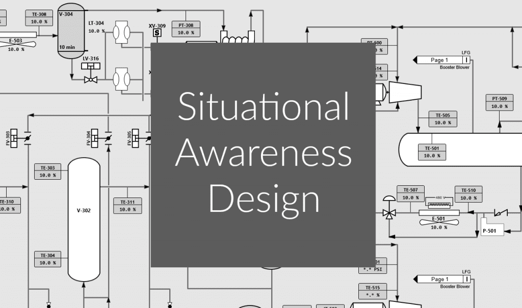
How to design a HMI for situational awareness
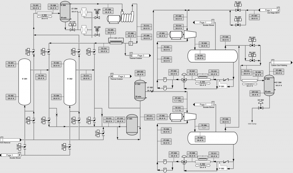
As we’ve already outlined in our blog about cluttered solar HMIs, too many values crammed on a busy display makes information difficult to process. With situational awareness, the simpler the better.
Here are situational awareness standards for designing an optimal HMI. Hint: if it provides little value, we’re going to cut it out.
Use graphs and charts to display setpoints
Today’s HMIs have too many numbers. People aren’t wired to look at dozens of numbers and make sense of them. Graphs and bar charts are almost always better than numerical values. The key to this is providing context. Without context, operators are forced to think and make their own interpretations.
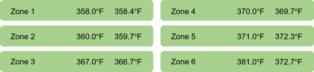
Here’s a test for you. You have 5 seconds to tell me which zone has an abnormal temperature. Ready, go!
Hard to tell, huh? Here’s the same data displayed in a situational awareness design.
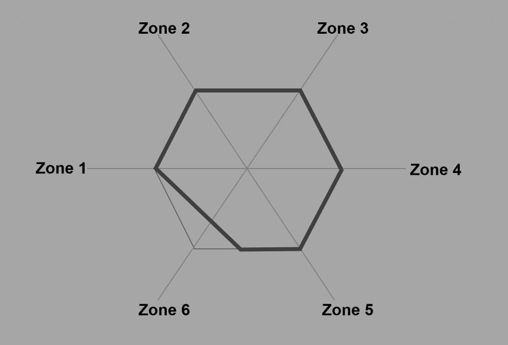
The best way to display normal vs. abnormal, is within graphs and charts. Depending on the data you’re displaying, a line chart that shows past trending electricity prices might be most helpful. Or, a polar star chart with real-time startup information.
The key here, no matter what chart is used, is to show the operator the setpoint, operating range, and/or alarm limit for each value. That’s a lot more valuable than plain numbers.
The best way to sort large amounts of data in charts is by normalizing. Real-time indicators line up when everything is normal. When something is wrong, the indicators go out of alignment (like the example above). You should be able to see which values are deviating the most within 5 seconds.
By adding in trended data, operators get an inside look into the future operations, based on past data. It’s kind of like weather forecasting. Trending tail data allows operators to react to situations before values get to an undesirable stage.
Cut out animation and custom graphics
I’ve seen HMIs with animated flames, motor fans spinning, and water bubbling. These HMIs definitely have a cool factor, but don’t provide any additional information to the operator. In fact, they’re drawing the operator’s eyes away from information (like alarms) they should be looking at. Movement is extremely distracting.
If you decide to use animation within SCADA, it should only be used to indicate an abnormal situation.
Similarly, 3d renderings of gauges, pipes, and turbines provide an interesting show and tell display when visitors pop in, but are extremely distracting to the operator and provide little to no extra value.
If you must use graphics use flat, monochromatic icons with no shading.
Only use color to indicate an abnormal situation
Situational awareness uses flat, monochromatic styling. Most people describe it as “boring”, but it’s supposed to be. Consistent color usage during normal times makes it very obvious when a high contrast color (like magenta, red, or yellow) does show up to indicate something is wrong.
Most situational awareness SCADA screens are presented on a gray background, because it’s not as fatiguing to the eye as high contrast white or black. Text and processes are drawn with a dark gray or black color palette, using line thickness to differentiate.
You aren’t limited to just gray. The key is to pick a subtle, monochromatic color that isn’t used to indicate an alarm situation. I’ve seen light green and blue situational awareness backgrounds that work quite well.
During an alarm, colors are used to outline processes that need to be looked at. Those outlines appear and disappear with the alarm condition. The use of a unique shape next to the color outline to indicate alarm priority is also recommended. (This is a great solution for color blindness.)
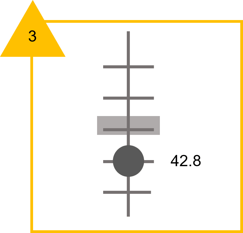
For example, a red square might mean critical, orange circle might indicate medium, and yellow triangle might mean low.
Moving to situational awareness will be hard, but it’s the direction the industry is going
I’ll be the first to admit that I’ve designed traditional HMIs with 3d graphics and lots of color. Typically, it’s because the customer requests it. Many owners are initially attracted to SCADA based on flashy examples.
The concept behind the traditional HMI design has been around for 30 years. It’s going to be very difficult for facilities to transition to this design…even the ones that understand why it’s necessary.
At Affinity Energy, we’re moving toward a more situational awareness approach to optimize our HMI design for operators for improved performance.
Designing for situational awareness can actually save you a fair amount in costs. After all, you’re not paying for custom generator graphics, and overall it’s a simpler design.
That being said, it takes a lot of thought process on both sides to understand how to best present each data set and make the HMI as information-rich as possible.
As a system integrator, if the process is not something we’re familiar with, we’ll want to understand what values are most important. We’ll need your KPIs. We’ll need to know the normal operating ranges for each sensor. We’ll also want to know what typically goes wrong in the process. All that information helps shape alarming, priority, and screen real estate.
Let us know how we can help you design a situationally aware HMI.
 Joshua King is an Application Engineer at Affinity Energy with responsibility for installing hardware, integrating Modbus networks, setting up site local area networks, configuring remote access connections, programming data loggers and other I/O devices, coding alarming logic, and integrating full remote monitoring systems at industrial-scale solar farms.
After building and testing a colored dye solar cell in high school, and graduating with a B.S. in Electrical Engineering at Clemson University, Joshua knew he would pursue a career related to solar power. With a strong educational background in solar and renewable energy, Joshua joined Affinity Energy in 2015.
His contributions include major enhancements to the remote monitoring systems at 20MW Gates County Solar Farm, 3MW Tolson Solar Farm, and 5MW Rockwell Solar Farm. Joshua is a classically-trained violin player, but really enjoys playing the fiddle. He played in a bluegrass band called Slim Pickens for three years.